Romance Framed in Time
Romance Framed in Time
Editorial | Event Branding
A tribute to Formosa
Editorial | Event Branding
A tribute to Formosa
Editorial | Event Branding
A tribute to Formosa
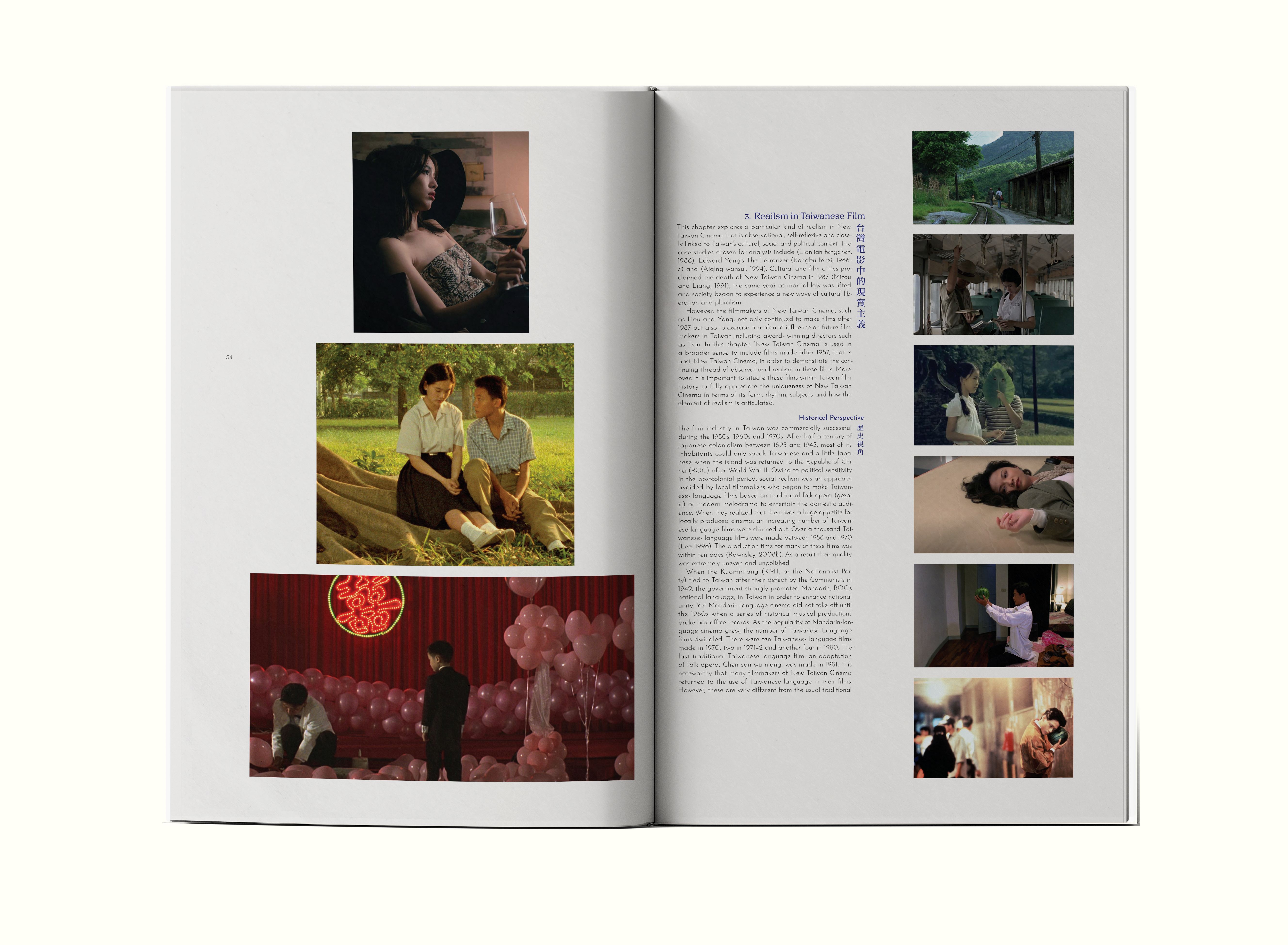
Romance Framed in Time (RFT) is a book that explores Taiwanese film, culture, and history—celebrating the island’s enduring commitment to portraying romance in all its forms. From joy to pain, beauty to struggle, RFT captures the emotional and nostalgic essence of Taiwan, offering a heartfelt tribute to the complexities of a place we call home.
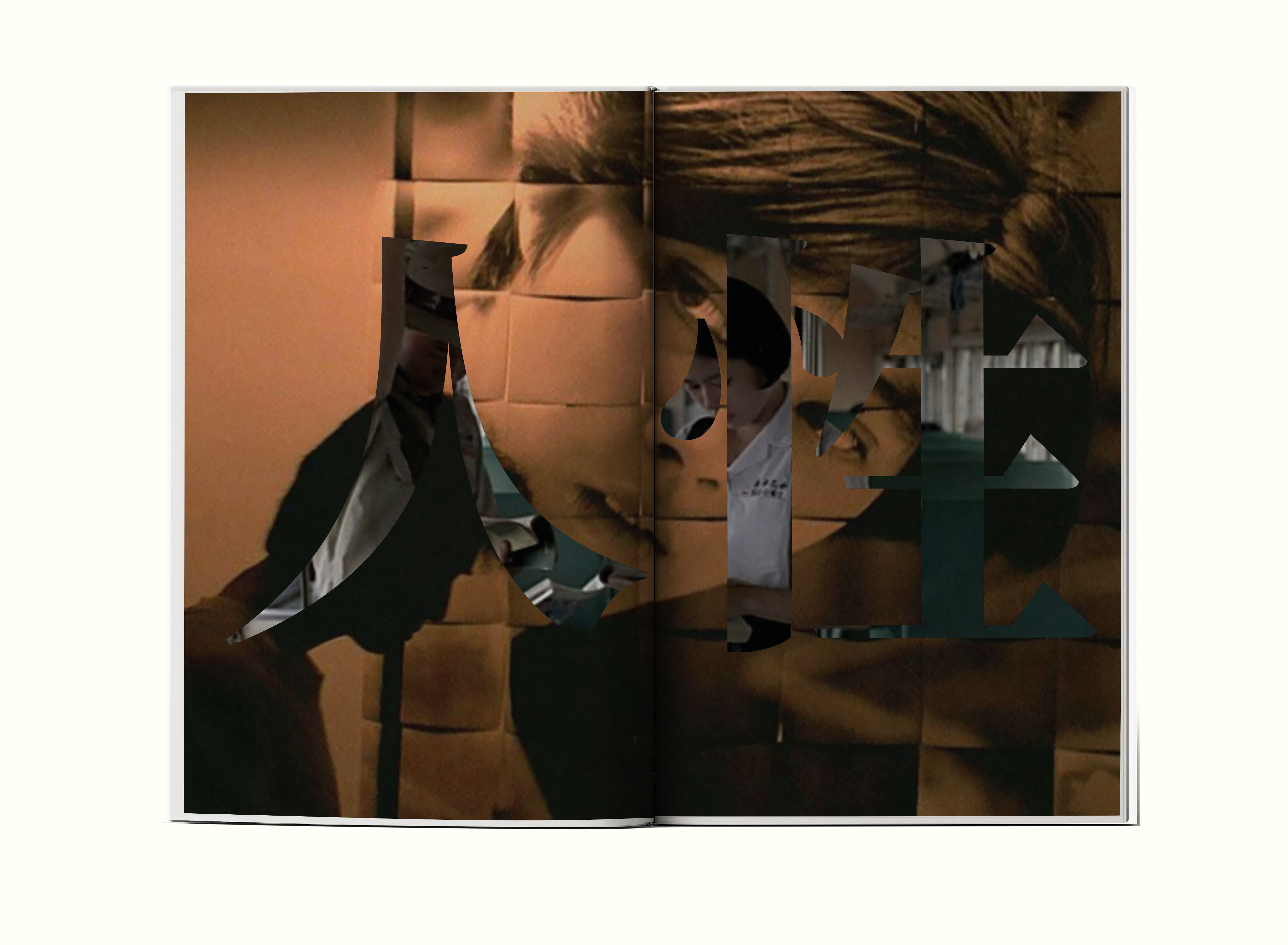
To evoke nostalgia, the typography is thoughtfully designed to resemble the flow of poems and handwritten letters. Photography is laid out in sequences reminiscent of photo strips, emphasizing memory, time, and emotion. The project also includes supporting media such as wristbands, promotional posters, video posters, and a coffee table book.
Instructed by: Cheri Gray
Romance Framed in Time (RFT) is a book that explores Taiwanese film, culture, and history—celebrating the island’s enduring commitment to portraying romance in all its forms. From joy to pain, beauty to struggle, RFT captures the emotional and nostalgic essence of Taiwan, offering a heartfelt tribute to the complexities of a place we call home.
To evoke nostalgia, the typography is thoughtfully designed to resemble the flow of poems and handwritten letters. Photography is laid out in sequences reminiscent of photo strips, emphasizing memory, time, and emotion. The project also includes supporting media such as wristbands, promotional posters, video posters, and a coffee table book.
Instructed by: Cheri Gray
Front/Back Cover
Front/Back Cover
Front/Back Cover

Featured Spreads
Featured Spreads
Featured Spreads


Look Book
Look Book
Look Book


Motion Poster
Motion Poster
Motion Poster
The motion poster incorporates imagery from both the book and the films referenced within it, creating a rich visual tapestry that speaks directly to its source material. The design language is carefully crafted to evoke a sense of nostalgia—drawing on familiar textures, colors, and compositions that feel timeless—while also introducing a layer of intrigue and mystery.
This balance between familiarity and enigma invites the viewer to explore the narrative further, hinting at hidden stories and emotional depth. Every visual choice, from typography to motion pacing, is intentional in reinforcing these dual feelings of comfort and curiosity.
Austin Liu
Austin Liu